
Table of Contents
Modern Minimalist Home Design: 6 Clever Space-Saving Tips
🎧 Listen to this article

In contemporary home renovation, what modern people pursue is often no longer elaborate and redundant decoration, but rather "minimalist and clean visual lines" and "functionality-first living utility." How can one, within a limited indoor space, satisfy massive storage needs without letting tall cabinets create a sense of spatial oppression? At the same time, how can one use clever material and lighting choices to avoid a minimalist style appearing monotonous? Decor Man has selected multiple completed case studies to decode the design secrets of modern homes.
1. White Space and Light Transmission: Creating an Airy, Breathing Feel
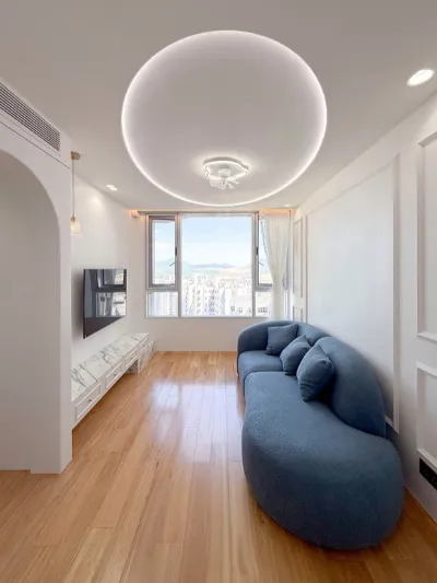
To eliminate the enclosed feeling of small units, making good use of visual "white space" and bright light and shadow is the core principle. Choosing high-brightness color schemes such as pure white and milky white for walls, combined with highly translucent flooring and ceiling lighting, can maximize the reflection of natural light and make the space appear spacious and transparent.
⭐ Kai Chui Court ⭐
- The ring-shaped ceiling light design is simple and stylish, not only providing even and ample illumination, but its round and smooth lines also complement the white walls and warm wood flooring, creating a bright and open visual sense for the living room.
⭐ Kai Chui Court ⭐
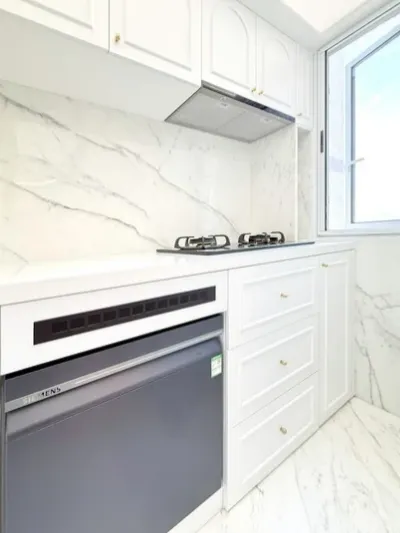
- The kitchen uses all-white European-style door panels together with glossy snow-white marble-patterned wall tiles and floor tiles. The large areas of white and glossy materials greatly enhance reflected daylight, instantly making the originally compact cooking space bright and clean.
2. Low Furniture Arrangement: Raising the Vertical Visual Space
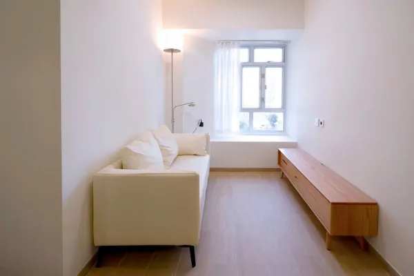
The height and volume of furniture have a direct impact on the sense of spatial oppression. In narrow or limited-area living rooms, choosing low-profile furniture with slender legs can leave a large amount of blank space from the middle of the wall to the ceiling, achieving the notable effect of lowering the visual center of gravity and enhancing the perceived ceiling height.
⭐ Sunshine City ⭐
- Pure white walls paired with light wood flooring, a low solid wood TV cabinet and a beige sofa stretch the vertical distance between the two side walls, and combined with natural light by the window, create a MUJI style full of breathability and transparency.
⭐ Sunshine City ⭐
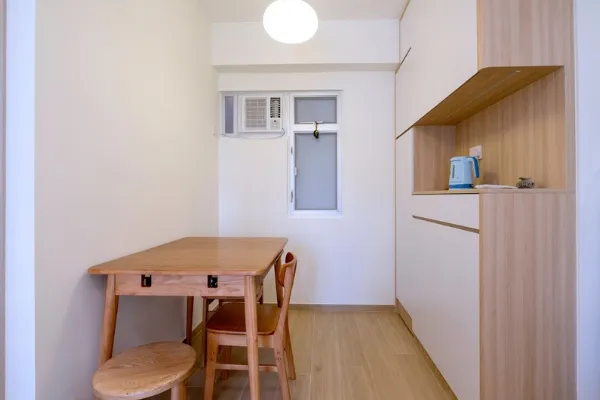
- The dining area continues the wood texture, with low solid wood dining table and chairs paired with an integrated hollow cabinet along the wall, providing a convenient display area and power supply while maintaining the simplicity and openness of the upper space.
3. Curves and Handleless Design: Visual Subtraction Aesthetics
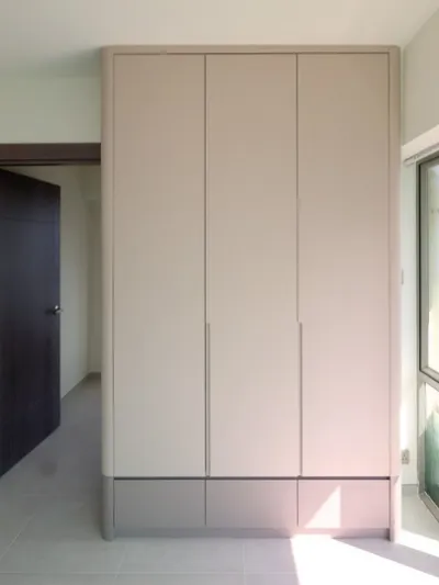
If tall cabinets have overly sharp lines, they can easily create a sense of oppression in corridors or passageways. Through "visual subtraction," using rounded edge wrapping to soften corners, combined with handleless or hidden sliding door designs, large storage cabinets can blend perfectly into the wall background.
⭐ The Victoria ⭐
- The floor-to-ceiling tall cabinet uses a soft rounded edge-wrapping technique at the corner, paired with vertically cut hidden long handles and zoning in light and dark wood tones, cleverly eliminating the oppressive feeling of sharp corners while enhancing the spatial proportions.
⭐ The Victoria ⭐
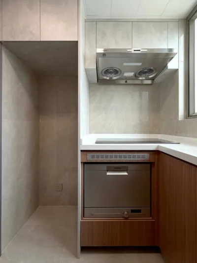
- The kitchen area uses minimalist gray-patterned walls, paired with handleless flat-opening cabinet doors and integrated appliance planning, keeping the overall visual effect extremely flat and unified.
4. Interplay of Solid and Void and Hollow Planning: Transparent Passage Design
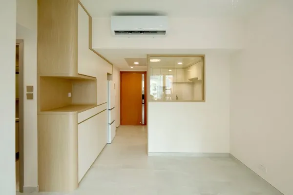
Corridors and entryways connecting different areas can easily appear dark and narrow. Using "solid-void combination" designs such as semi-open glass windows, floating cabinets, or hollow display cabinets can flexibly divide functional zones while allowing daylight to penetrate unobstructed into every corner.
⭐ Chelsea Court ⭐
- The corner cabinet on the left adopts a streamlined curved hollow shape, reserving display space; the kitchen wall on the right is embedded with a wood-framed half-height glass window, guiding light to pass through and greatly enhancing the daylighting and visual extension of the entry passage.
⭐ Chelsea Court ⭐
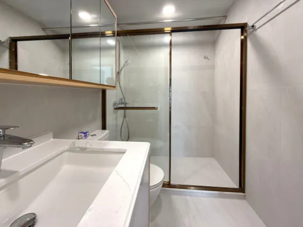
- The bathroom extends the transparent texture, using glass doors with bronze metal frames and marble-patterned countertops, cleanly and neatly dividing the dry and wet areas below while maintaining visual lightness and cleanliness.
5. Textured Marble and Artistic Lighting: Lighting Up Subtle Luxury Focal Points
Against a simple spatial base tone, precisely adding key materials with handmade texture or subtle luxury patterns can inject soul and layering into the home. Using marble back panels or special translucent lighting fixtures can light up focal points without increasing visual noise.
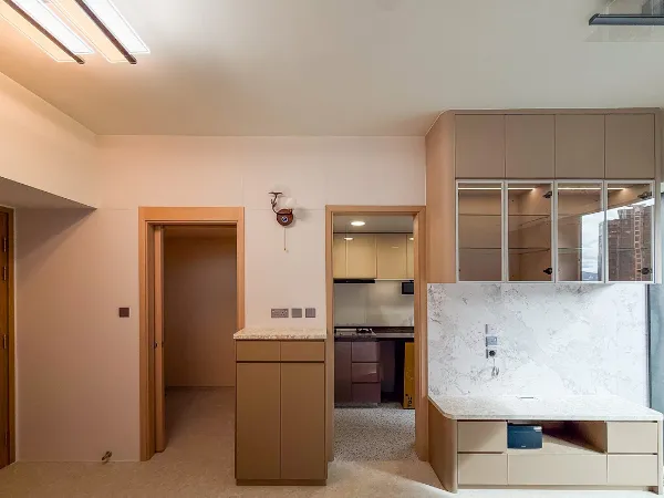
⭐ Double Cove ⭐
- The modular cabinet combines a glass display cabinet, warm light strips, and a marble-textured stone back panel, stacking rich and luxurious texture layers within a simple layout.
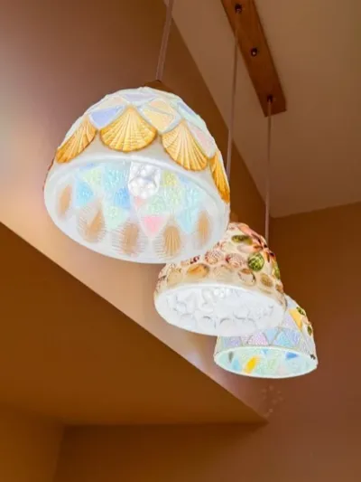
⭐ Double Cove ⭐
- A delicate glass-textured pendant light, with colored patchwork translucent material emitting gentle and romantic light and shadow as light passes through, becomes the artistic finishing touch in the space, injecting personality and warmth into the simple home.
6. Feature Tiles and Personalized Bathrooms: Immersive Relaxation Spaces
Bathroom spaces should not be limited to monotonous white ceramic tiles. Through the choice of wall tile materials and geometric laying techniques, combined with light and shadow mirrors, a compact bathroom can be transformed into an immersive relaxation space comparable to a boutique hotel.
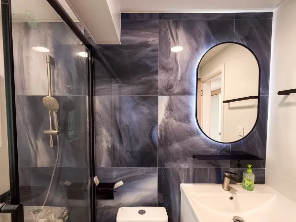
⭐ Parc Regal ⭐
- The walls are laid with large-format tiles featuring flowing cloud-like blue-gray marble textures, paired with a black-framed glass door and an oval vanity mirror with backlit ring lighting, creating a premium, tranquil, subtly luxurious hotel atmosphere.
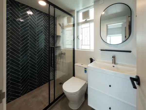
⭐ Parc Regal ⭐
- The shower stall wall uses highly distinctive dark green tiles laid in a "herringbone" pattern; the strong geometric lines contrast with the white washstand, adding atmosphere-renewing power to the narrow space.
Conclusion: Stacking an Ideal Lifestyle Scene with Details
A beautiful home wins through these thoughtful details. Interior design is not about blindly following trends, but about finding the balance point that best suits one's own living habits. Want to learn more about interior design styles and home renovation planning? Book now for a free measurement by a professional renovation consultant? Feel free to browse the "Decor Man" website anytime and start your journey toward an ideal home!
From renovation quotations to before and after move-in, one-stop comprehensive support!
>> Get a free renovation quotation: https://hkdecoman.com/measure
>> Book a home clinic (inspection/cleaning/repair): https://clinic.deco-x.com/
Special zones for various housing types:
>> Public housing https://decoman-publichousing.com/
>> Private housing https://decoman-privatehousing.com/
>> First-hand new developments https://decoman-newproperties.com/
>> Tong Lau buildings https://decoman-tenement.com/
================================================================
*** This article is authorized for reprint by Decor Man ***